Best Email Builder for Marketers: What to Look for in 2026
An email can look slick and tidy in a drag-and-drop editor. Then a subscriber opens it in Gmail on Android, Apple Mail, or Outlook, and the layout shifts, buttons shrink, and text gets smaller. That is why marketers need a lot more than a visual editor.
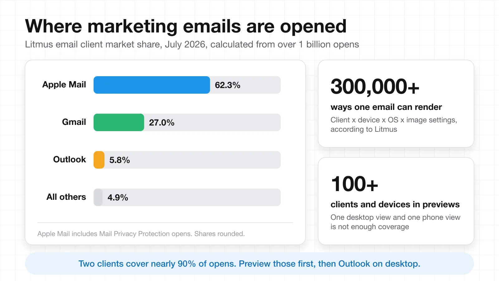
Litmus calculates its email client market share from over a billion opens each month. In the July 2026 data, Apple Mail and Gmail together account for nearly 90% of measured opens. A responsive email builder helps teams create content that holds up across those viewing environments without building every campaign twice.
The real benefit for marketers is control. Reusable blocks keep the brand consistent, responsive rules adapt the layout for smaller screens, and previews reveal problems before the send. With the right responsive email builder, the team spends less time on repetitive design and more on copy, offers, testing, and campaign strategy. It also makes each send easier to review and repeat.
Key takeaways
- Apple Mail and Gmail account for nearly 90% of opens in Litmus's July 2026 data, yet a single email can still render in 300,000+ ways across clients, devices, and settings.
- Judge a builder on five things: drag-and-drop control, mobile and desktop previews, reusable blocks, brand controls, and export and integration options.
- The best email builders add automatic responsive behavior, code access for edge cases, saved modules, real-time review, and client previews on top of basic editing.
- Do not choose from the template gallery. Build one real campaign, time the edit-approve-test-export loop, and pick the tool that shortens it.
What marketers should look for in an email builder
A winning email builder makes frequent email marketing much faster without taking power away from the marketer. That balance matters. You should not need a designer every time you move a CTA, change padding on mobile, reuse a product block, or adjust a template. Mailchimp, for example, keeps its templates no wider than 600 pixels so they work in most email clients, and uses media queries so columns and font sizes adjust to the screen they are viewed on.
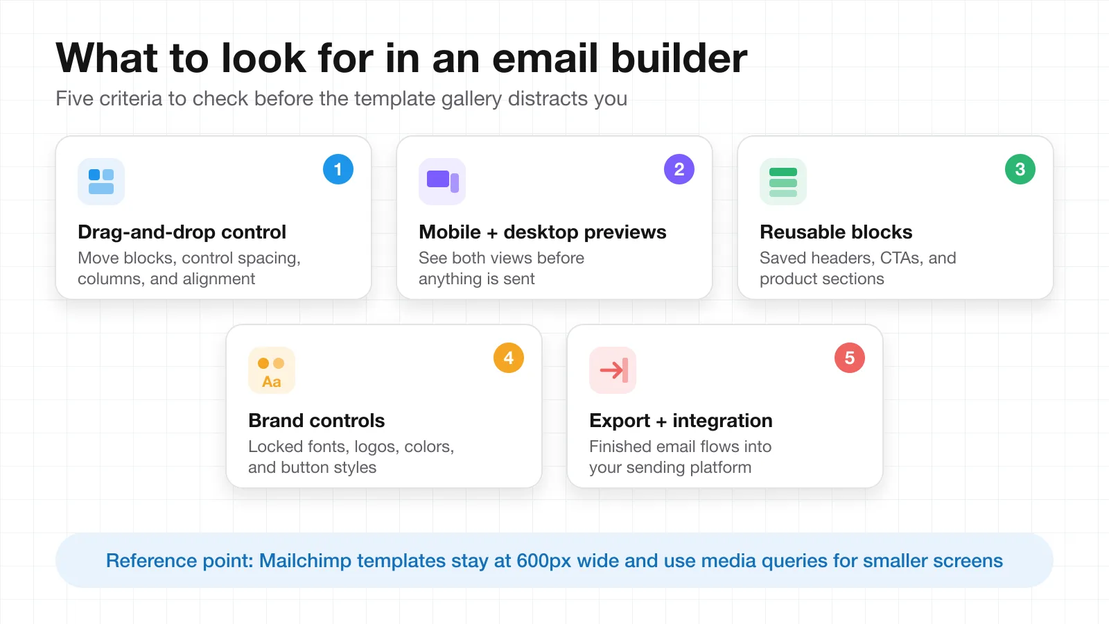
When evaluating a responsive email builder, look at these five things:
- Drag-and-drop control. It should be easy to move blocks around and just as easy to control spacing, columns, and alignment.
- Mobile and desktop previews. Marketers should see both before sending.
- Reusable blocks, sections, and templates. Repeated headers, CTAs, and product areas save production time.
- Brand controls. Saved fonts, logos, colors, and button styles keep every campaign consistent.
- Export and integration options. The finished email should flow into the system where your team already operates.
If your team is still deciding whether email deserves the effort at all, start with this overview of the pros and cons of email marketing before comparing tools.
How a responsive email builder improves campaign work
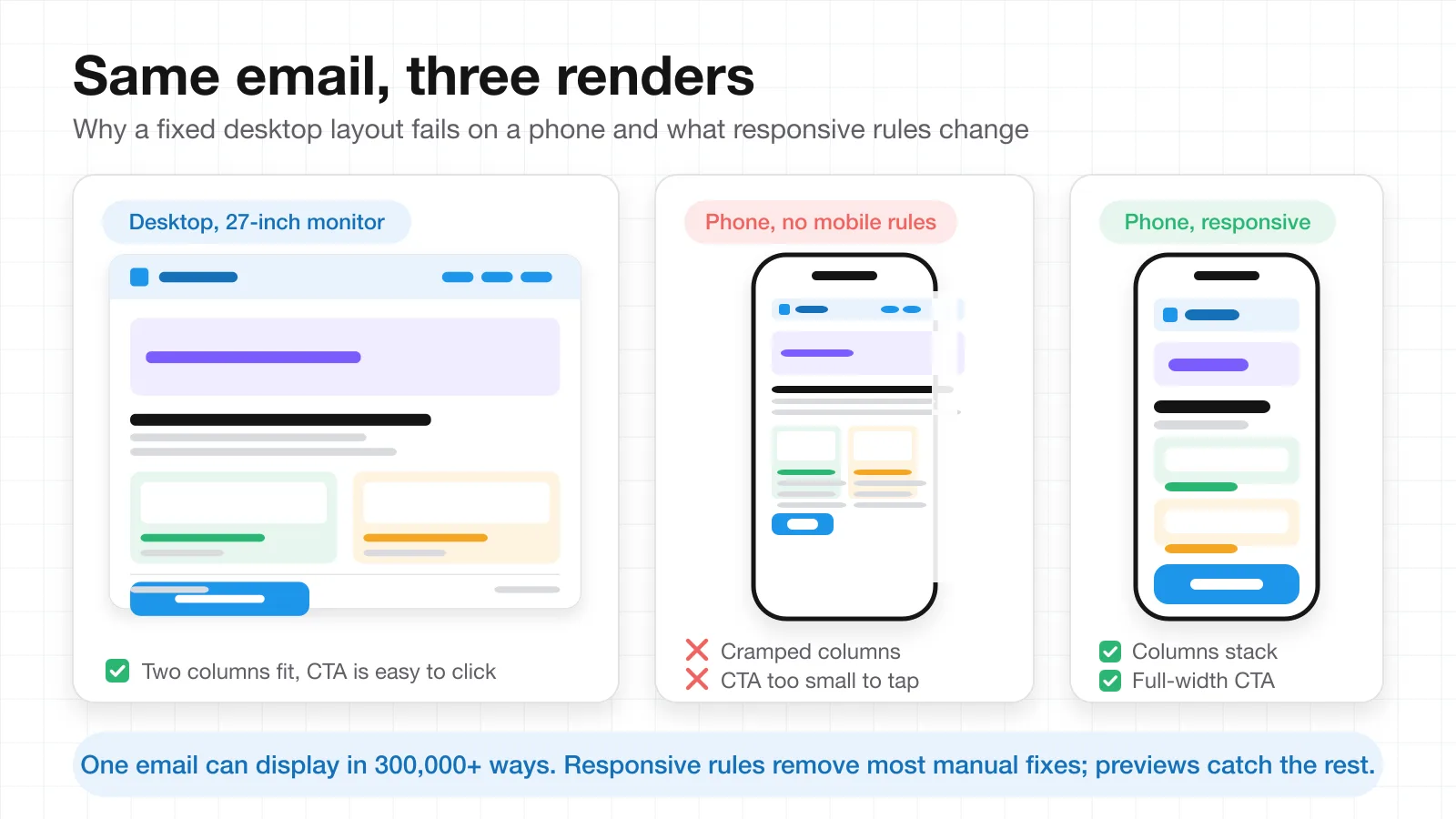
A clean email on a 27-inch monitor can be a mess on a phone. A two-column offer gets cramped, text wraps badly, and a CTA becomes too small to tap. Resolving those issues manually, one campaign at a time, is time-consuming. You can use a responsive email builder for most of the above with flexible layouts, mobile rules, and content blocks that resize to fit the screen. It is hard to appreciate the magnitude of the issue until you have seen the numbers.
With screen size, operating system, email client, and image settings all in play, Litmus estimates that an email can display in 300,000+ different ways. The same market share data puts Apple Mail at about 62% and Gmail at about 27% of opens in July 2026, so the two together hold nearly 90% of the measured email-client market. Outlook holds under 6%, but its desktop versions render HTML differently enough that they still deserve a dedicated preview.
That is good news for marketing teams, because last-minute fixes drop. Designers can build a module once, get it approved, and marketers can reuse it in new campaigns without modifying the basic layout. A trustworthy responsive email builder also keeps spacing, buttons, fonts, and brand components consistent, which makes review easier and reduces mistakes between emails.
The same principle applies upstream of the design. Teams that keep the campaign brief, copy, and approvals in one shared workspace ship fewer inconsistent emails. This guide to keeping external communication aligned covers that side of the workflow.
Features that separate the best email builders from basic tools
Once a team moves beyond basic newsletters, plain drag-and-drop editing is no longer good enough. More people read the campaigns, the work gets more complicated, and minor layout issues can delay a send. Ideally, a responsive email builder creates a responsive email automatically for routine campaigns, and still lets email designers edit code when something custom is needed.
The features that make the biggest difference:
- Automatic responsive behavior. Columns, images, spacing, and buttons should adjust on their own on a smaller screen and should not need a manual rebuild.
- Code access for edge cases. Advanced users need custom HTML and CSS for layouts or elements that standard blocks do not cover. Mailchimp, for instance, offers custom HTML blocks and documents media queries for responsive email code.
- Saved modules. Reusable headers, product cards, footers, and CTA sections cut repetitive work.
- Real-time editing and approval. Shared reviews minimize version confusion and missed changes.
- Client previews. Litmus previews cover 100+ email clients and devices, which matters when one email can render in 300,000+ ways.
- Fast handoff. Moving the finished email into the team's sending platform should take a couple of minutes, not another rebuild.
Here is how those features look side by side.
| Capability | Basic drag-and-drop editor | Best-in-class responsive email builder |
|---|---|---|
| Mobile layout | Manual fixes on every campaign | Automatic rules for columns, images, and buttons |
| Custom elements | Limited to stock blocks | Custom HTML and CSS where standard blocks fall short |
| Reuse | Copy and paste between emails | Saved modules with brand controls |
| Review | Screenshots and email threads | Real-time editing and approval in one place |
| Testing | One desktop view and one phone view | Previews across 100+ email clients and devices |
| Handoff | Rebuild inside the sending platform | Export or direct integration |
If your bottleneck is the first draft rather than the layout, an AI email generator can speed up the copy, and our guide to creating an email template with AI shows how a prompt-based draft moves into an editable layout.
How to choose the best email builder for your marketing team
The best email builder depends on how your team actually works. A small marketing team sending two newsletters a month has different needs from a team producing daily campaigns across several brands. Start with campaign volume, the number of people who edit or approve emails, design needs, and the tools already used for sending.
Don't choose a responsive email builder because its template gallery looks impressive. Build one real campaign first. Use your normal header, product blocks, images, CTA buttons, footer, and brand fonts. Then check how quickly the team can edit it, approve changes, and move it into the current email platform.
Testing matters here. Litmus supports previews across 100+ email clients and devices, which shows why checking only one desktop and one phone view isn't enough. Mailchimp also notes that responsive custom email code may require media queries to adapt content for different devices.
A useful responsive email builder should fit your existing workflow rather than force the team to rebuild it.
A one-campaign test you can run in an afternoon
The fastest way to compare tools is to put each one through the same real campaign and time every step.
- Rebuild a recent campaign. Recreate an email you sent last month, with the real header, product blocks, footer, and brand fonts. Note how long setup takes and how many blocks you had to build from scratch.
- Make three mobile edits. Change the padding on a CTA, stack a two-column section, and swap an image. Count how many of those edits needed a designer or a code change.
- Route it for approval. Send the draft to the people who normally sign off. Check whether they can comment and approve in the builder or need screenshots and a separate thread.
- Preview in the clients that matter. At minimum, check Apple Mail, Gmail on Android, and Outlook on desktop. Note what broke and how long the fixes took.
- Export to your sending platform. Move the finished email into your ESP. If that step turns into another rebuild, the builder does not fit your workflow.
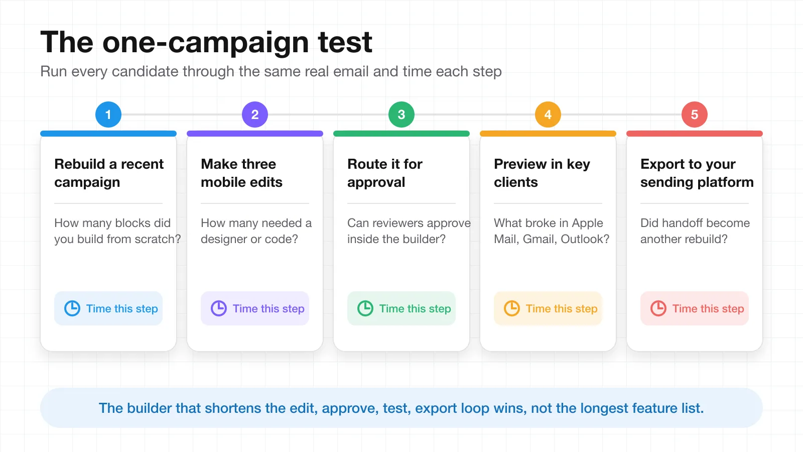
Score each step against your current process. The builder that shortens the loop is usually the right one, even if another tool has a longer feature list. Planning the campaigns themselves is a separate problem, and a content calendar template keeps send dates, owners, and approvals visible before production starts.
Choose a builder that fits the way your team works
Don't assume the email builder with the most features is the best. The best one is the tool your team can use for the entire week without wasting time on the same fixes. Put responsive design first, then editing speed, reusability, integrations, and how easily designers and marketers can review the same campaign.
A good responsive email builder minimizes repetitive tasks and keeps marketers in control of the layout, branding, content, and the necessary checks. Testing is particularly important because the various email clients do not interpret HTML the same way. Mailchimp recommends media queries for custom-coded responsive emails, and Litmus supports previews in 100+ email clients and devices.
Do not pick a tool until you have created one actual campaign from start to finish. Time the editing, review, testing, and export process. If the builder does those steps more easily and does not restrict your team, you have found a successful email builder. The objective is not additional features. It is quicker, tidier, and more effective campaign production.
Frequently Asked Questions
What is a responsive email builder?
A responsive email builder is an email design tool that adapts a layout to the screen it is opened on. Columns stack, images scale, and buttons stay large enough to tap on a phone without the marketer rebuilding the email for each device. Most builders combine drag-and-drop editing with mobile rules, reusable blocks, and previews.
Why does the same email look different in Gmail, Apple Mail, and Outlook?
Each email client uses its own rendering engine and supports a different subset of HTML and CSS. Screen size, operating system, and image settings add more variables, which is why Litmus estimates that one email can display in 300,000+ different ways. Previews across the clients your subscribers actually use are the only reliable way to catch the differences.
How wide should a marketing email be?
Mailchimp keeps its templates at a maximum of 600 pixels so they fit the preview panes of most desktop clients. A responsive email builder then uses media queries or built-in mobile rules to scale that layout down for phones, so you design once at 600 pixels and let the rules handle smaller screens.
Do I still need to test emails if I use a responsive builder?
Yes. A responsive builder removes most manual layout fixes, but it cannot control how every client interprets the code. Preview at least the clients that dominate your audience, which for most lists means Apple Mail, Gmail, and Outlook, and check dark mode as well as light mode before the send.
How many email clients should I test?
Start with the clients that account for the majority of your opens. Litmus's July 2026 data shows Apple Mail and Gmail together at nearly 90%, so those two come first, followed by Outlook on desktop. Tools such as Litmus offer previews across 100+ clients and devices when you need broader coverage.
Related Articles
How to Create an Email Template with AI: A Step-by-Step Guide for 2026
Free AI Email Generators That Cut Writing Time Fast
Email Marketing Pros, Cons, and 5 Steps to Launch Fast
From Campaign Brief to Customer Update: How Teams Keep External Communication Aligned