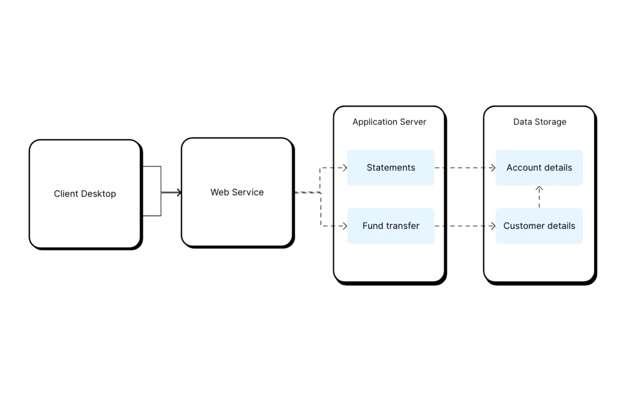
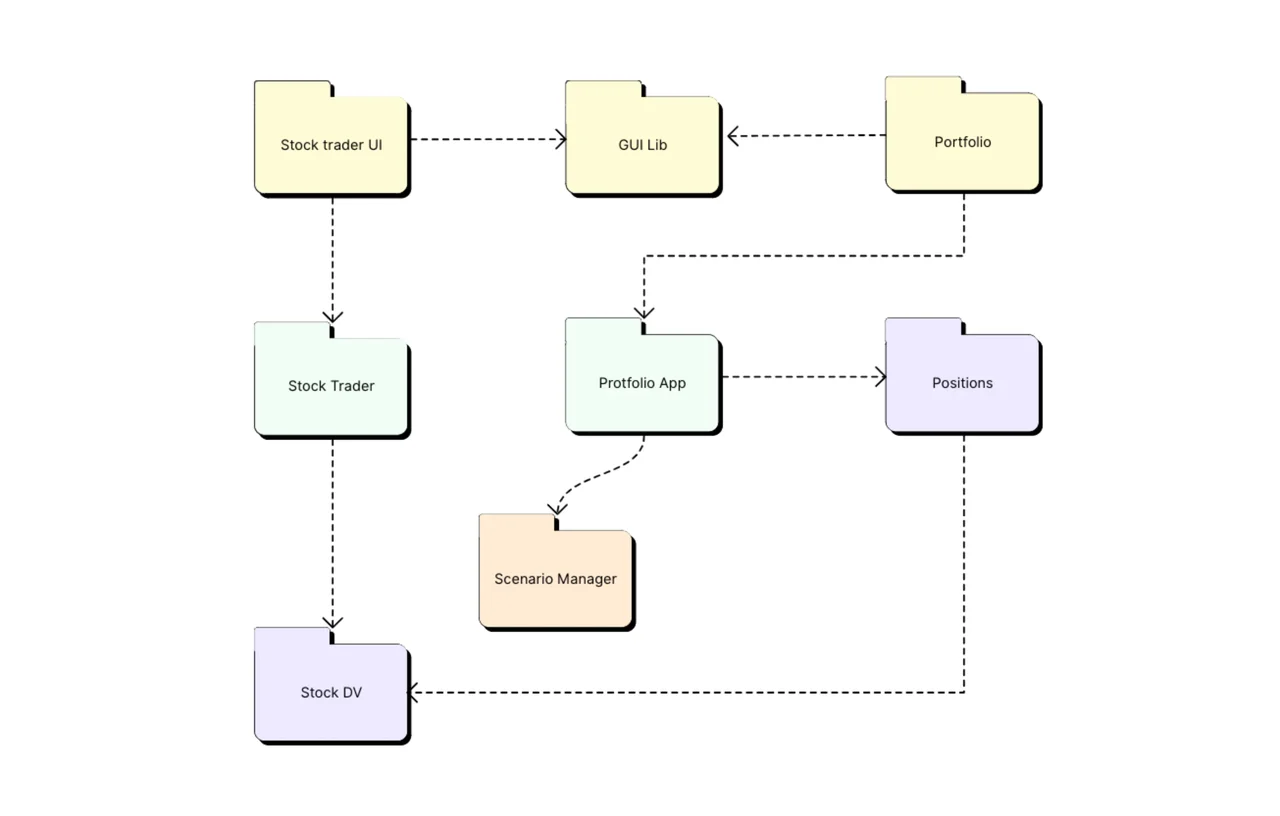
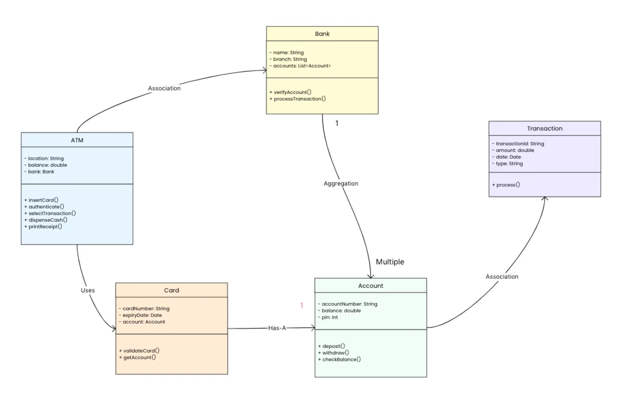
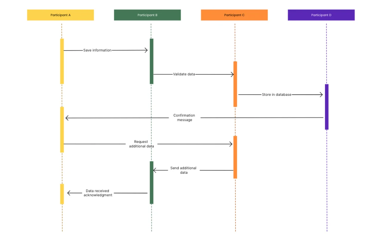
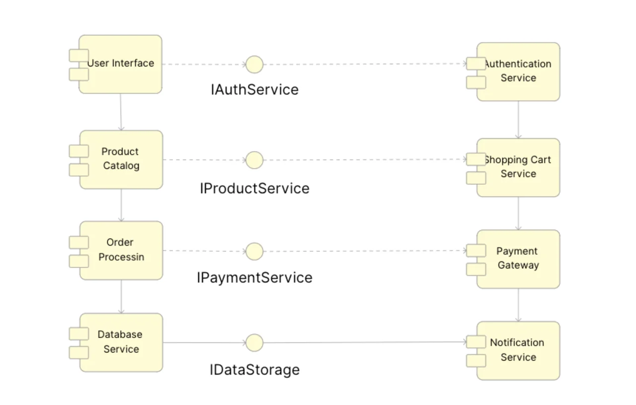
A component diagram is a UML structural diagram that shows the modular parts of a software system, the interfaces each part provides or requires, and the dependencies between them. This AFFiNE template gives you an editable whiteboard example of an e-commerce system with eight components connected through four named interfaces, so you can adapt a working layout instead of drawing from scratch.
What's included in this template
- Eight components drawn with the UML component symbol: User Interface, Product Catalog, Order Processing, Database Service, Authentication Service, Shopping Cart Service, Payment Gateway, and Notification Service.
- Four interfaces shown as lollipop (circle) symbols: IAuthService, IProductService, IPaymentService, and IDataStorage.
- Dependency arrows linking components through those interfaces, plus vertical flows that show the order of processing on each side.
- An edgeless canvas in AFFiNE, so you can move shapes, add components, and annotate the diagram freely.
When to use a component diagram
- Planning a new system: split the application into modules and agree on the interfaces between them before writing code.
- Documenting an existing codebase: give new developers a high-level map of services and how they depend on each other.
- Moving to microservices: see which components can be separated and which interfaces they will need to expose.
- Reviewing change impact: trace dependencies to see what else is affected when one component changes.
How to use this component diagram in AFFiNE
- Duplicate the template. Click Use this template to open a copy in your AFFiNE workspace.
- List your components. Rename the sample boxes to the real modules, services, or libraries in your system, and delete any you do not need.
- Define the interfaces. Rename the circle symbols to the interfaces each component provides, such as an API or service contract.
- Draw the dependencies. Connect each component that requires an interface to the component that provides it, using dashed arrows.
- Add notes for context. Place text near components to record owners, technologies, or open questions.
- Share and export. Invite teammates to review the diagram, or export it as an image or PDF for design documents.
Component diagram symbols at a glance
- Component: a rectangle with two small tabs on its left edge (or a
<<component>> label).
- Provided interface: a full circle ("lollipop") attached to the component that offers a service.
- Required interface: a half circle ("socket") on the component that uses the service.
- Dependency: a dashed arrow from the component that depends on another.
If you need to show where these components run on servers or devices, pair this template with the deployment diagram template. For grouping classes into namespaces, use the package diagram template. To show the whole system and its external actors first, start with a system context diagram. More examples are in our diagram template collection.
Frequently asked questions
What is the purpose of a component diagram?
It shows how a system is divided into replaceable parts and how those parts connect through interfaces. Teams use it to plan architecture, document systems, and judge the impact of changes.
What is the difference between a component diagram and a class diagram?
A class diagram shows individual classes with their attributes and methods. A component diagram works at a higher level and shows larger modules, such as services or libraries, and the interfaces between them.
What is the difference between a component diagram and a deployment diagram?
A component diagram shows the logical structure of the software. A deployment diagram shows the physical nodes, such as servers or devices, where those components are installed and run.
Can I edit this component diagram for free?
Yes. You can duplicate the template into your AFFiNE workspace at no cost and change every shape, label, and connector.